

Juelerye
A NEW JEWELRY BOUTIQUE IN BEAUTIFUL DOWNTOWN CORNELIUS NORTH CAROLINA
_
Jacqueline, my client and the owner of Juelerye fell in love with a line of products by Anna Balkin. After purchasing several of Anna's designs, Jacqueline decided to approach Anna about launching her own store and carrying jewelry from the Anna Balkin line. Thus Juelerye was born.
The goals for the visual identity of Juelerye are two-fold; that it should appeal to a wide age range of women who value authentic products of excellent quality, and to communicate a friendliness that represents the heart of the brand - to inspire people to feel beautiful.
Logo +
Branding +
Web +
Strategy +
Photos +
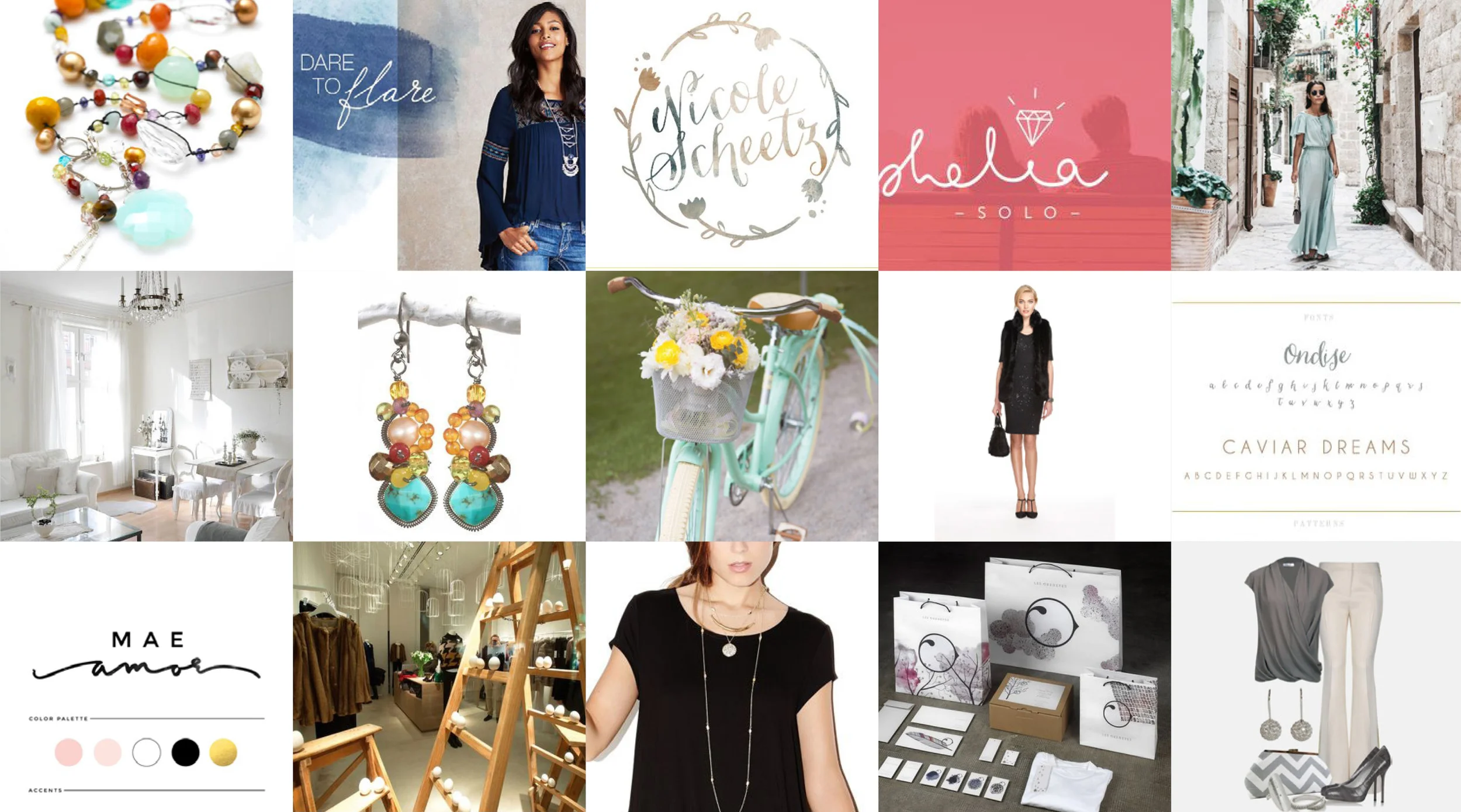
Mood Board
_
This collection of visual ideas represents the design style of Juelerye.
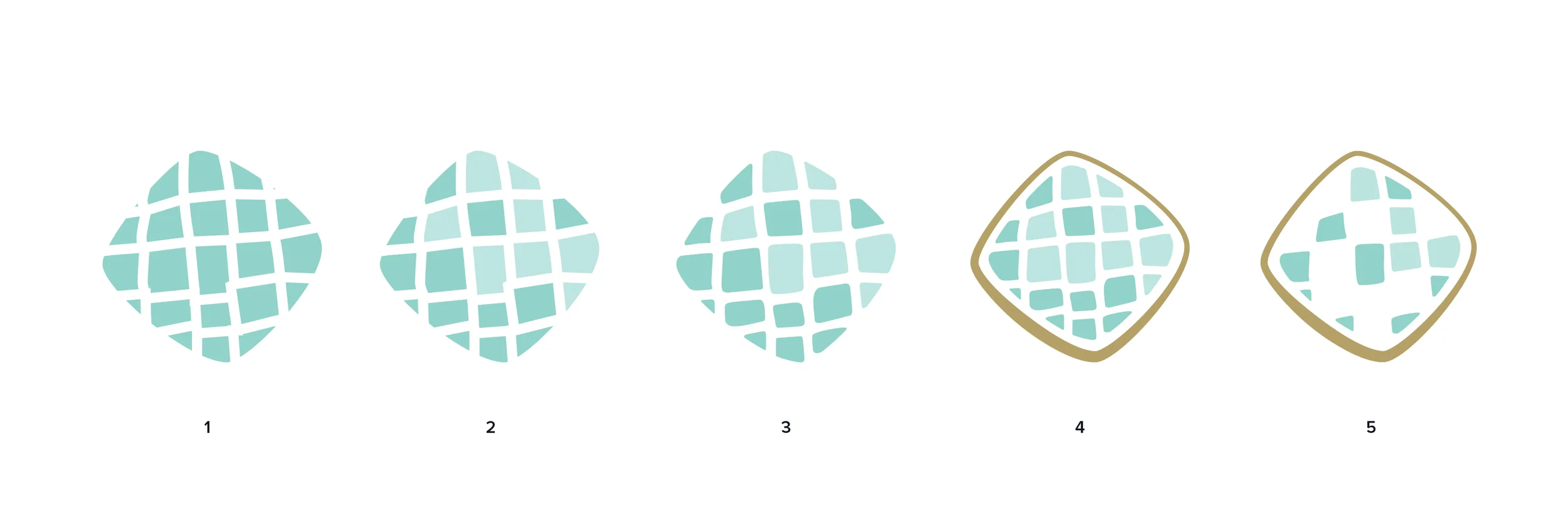
Evolution Of The Icon
_
The icon was inspired by the patterns of color created by the shapes cut into the stones in Anna’s jewelery.
The first shape began with a simple geometric pattern of rough squares, and evolved to remove sharp corners and add a containing element designed to resemble the metal strands that surround the stones in many of the jewelry designs.
The final shape is a more abstract, less geometric design over all.
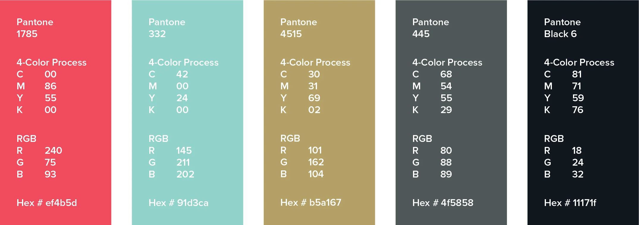
Colors
_
This color palette was inspired by the mood board.
The weight of the brand will fall on the shade of teal green and gold, and supported by the red as an accent color. A dark gray and solid black are the neutral base colors that will be used for copy text etc. in print design.
Applied Design
_
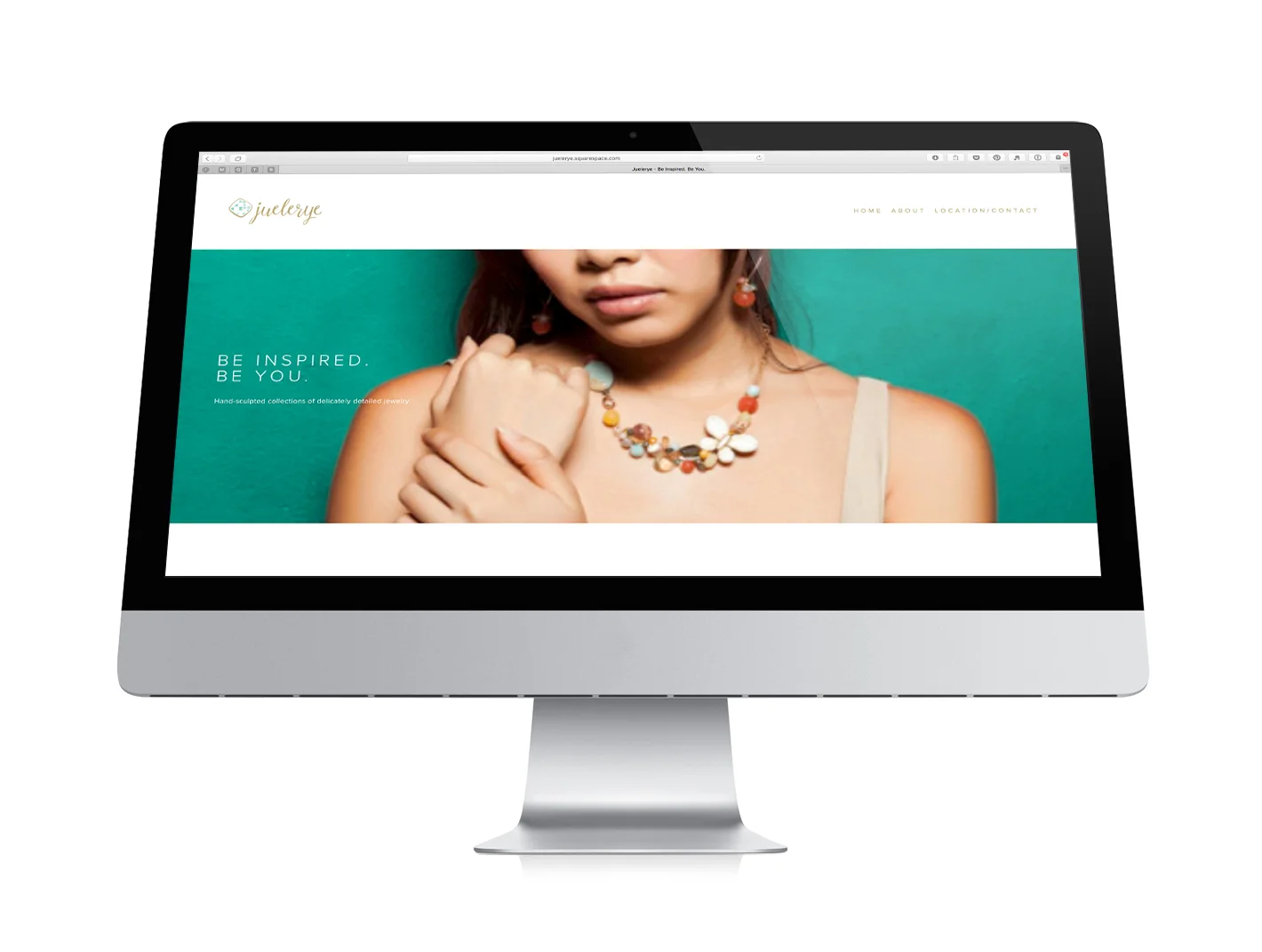
Website Design

Brand Stationary

Instagram and Facebook Ad Designs